Flyers
| flyer_peer_editing.docx |
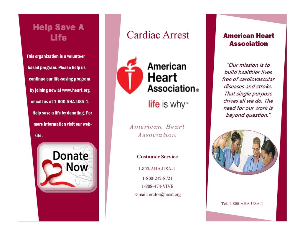
Tri-fold Brochure #1
Photoshop Edits
|
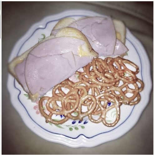
For this picture I increased the saturation to a point where the food had a nice color, I also blurred the background so that the food was the center of attention. I also lowered the brightness so it wasn't so blurry/ bright anymore.
|
|
|
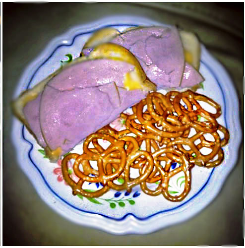
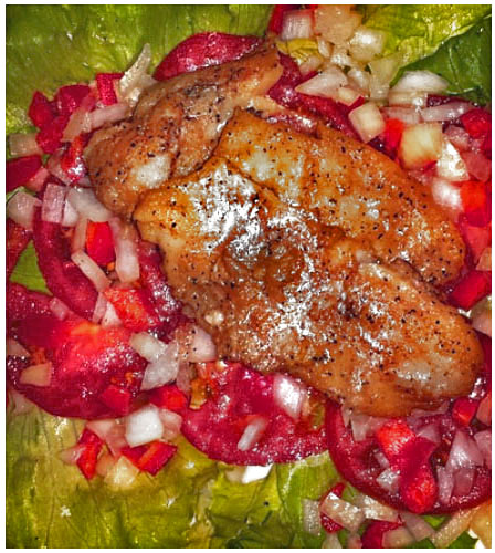
For this picture I increased the saturation to make the food look better and give the chicken a more golden look and to make the tomatoes more red, bright, and appealing. I also used color balance and put it more towards red to get that look for the tomatoes.
|
|
|
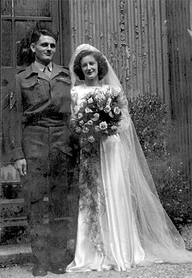
For this picture I cropped it so it didn't look as damaged as it was before. I than used the burn tool and used it on the area next the man's arm because before his arm was blurry and you couldn't really see the outline of it so I burned around it to make it darker. I also used the blur tool to blur the background so that the focus is on the people.
|
|
|
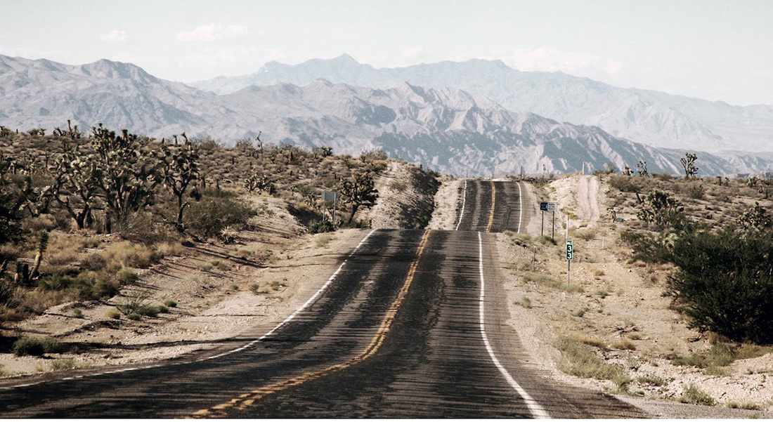
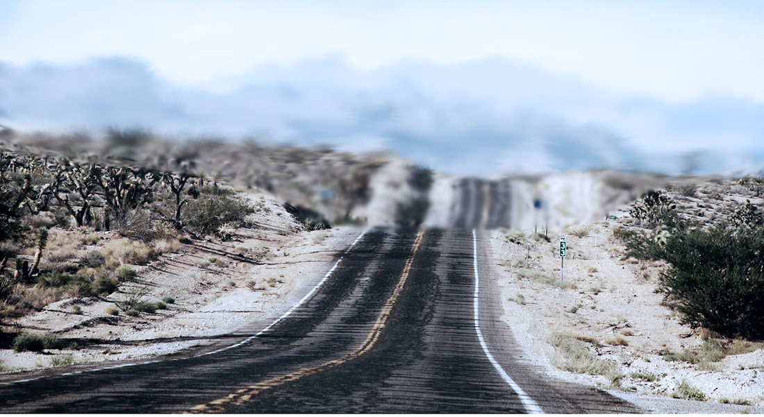
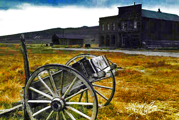
For this image I blurred the background hills and smudged the sky to give it a cool cloudy affect and then I used the sponge tool to soak up some color on the land areas to give it a more cloudier look. I added a cooling tint to the photo. I also raised the contrast to define things in this picture a bit more.
|
|
|
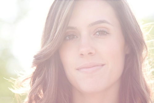
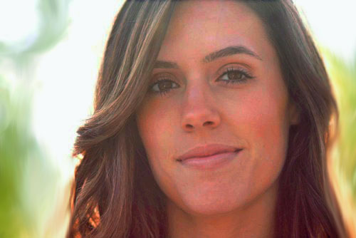
For this image I lowered the brightness and raised the saturation so that the women had more color to her face and less of the light blurring the picture. I also used the smudge tool on the background to mix the colors together and to make it look nicer.
|
|
|
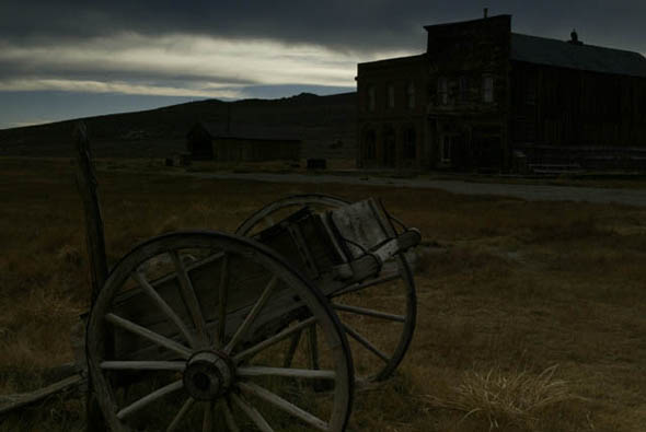
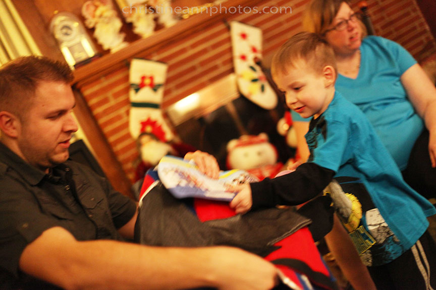
For this picture I raised the brightness and then raised the vibrancy and saturation. I also burred the background a bit like on the wall of the building.
|
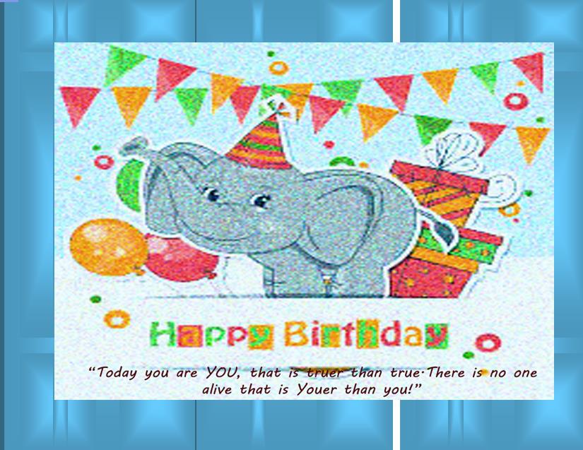
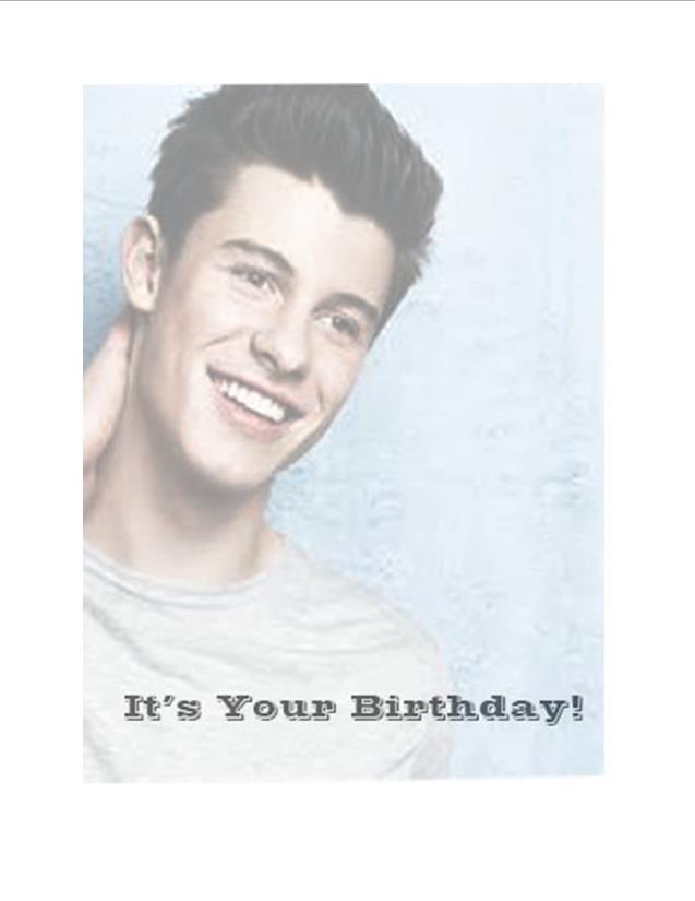
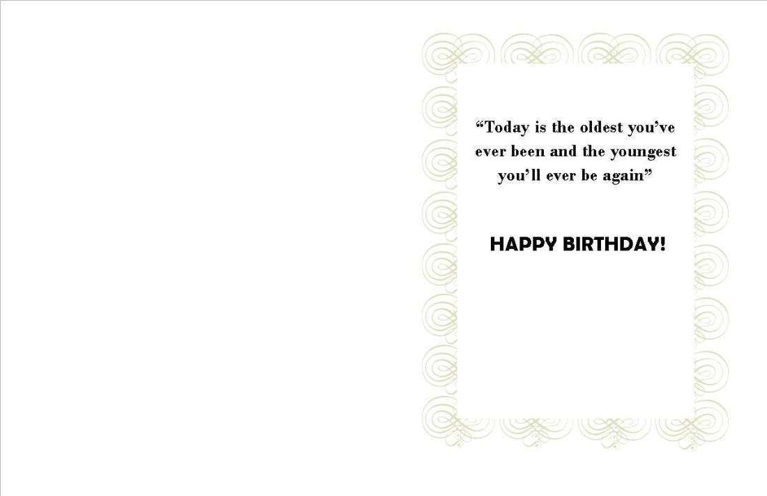
Greeting Cards
|
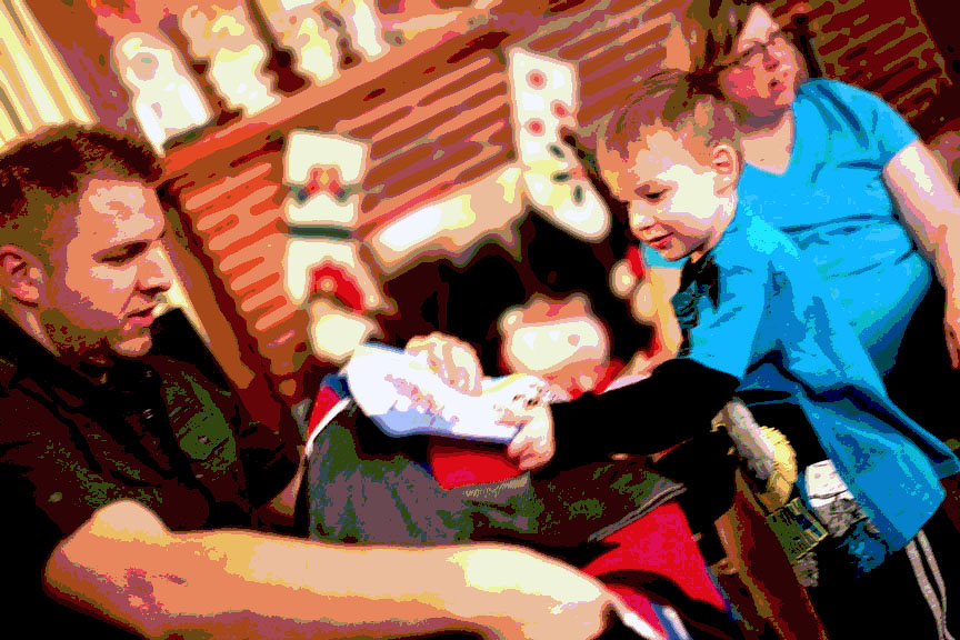
For this picture I raised the brightness and then raised the vibrancy and saturation. I also posterized 5 levels.
|
|
|
For this image I adjusted the contrast and brightness of the photo, and I also made the colors more vibrant. I gave it a filter from the filter gallery and also gave it a cooling filter. And I also added a textbox to the photo
|